Overview
Year: 2026
Sector: Cryptocurrencies
Role: Concept Development & Design Adaptation
Project: Design Test
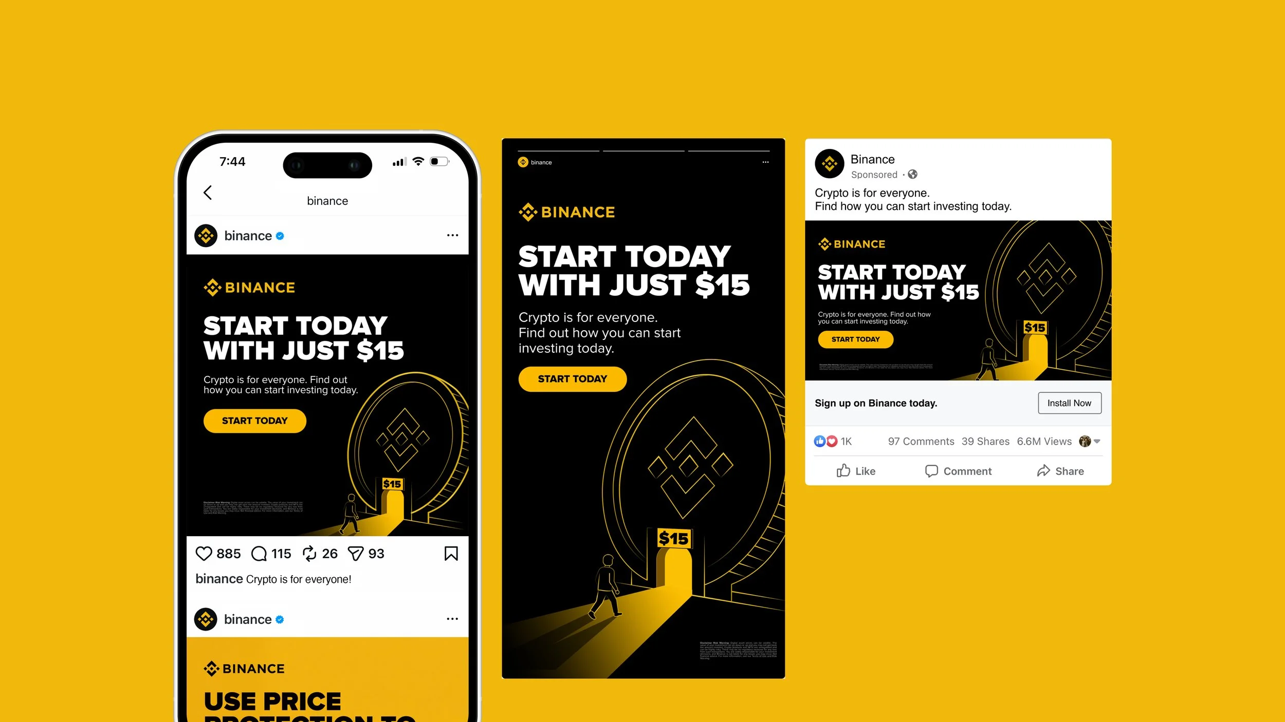
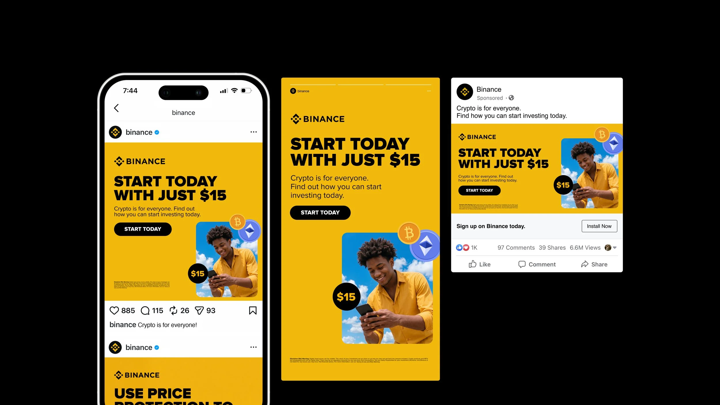
This project covered two briefs for Binance: a campaign concept to show that anyone can start investing in crypto with as little as $15, and paid ad adaptations for the Price Protection campaign.
When I received the brief, the message was clear: many people don't know they can start investing in crypto with a small amount of money. So I looked for a way to represent the real barrier: perception. Crypto can feel huge from the outside, but the first step doesn't have to be.
The concept
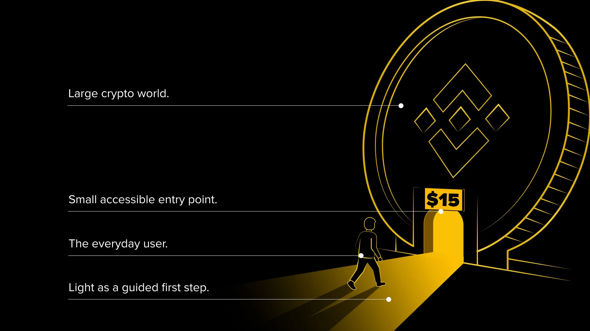
I chose to represent crypto as a large world with a small, accessible entry point.
This world is visualized as a crypto-inspired structure that feels modern, expansive and slightly intimidating from the outside. At its base, a small illuminated entrance marked with $15 shows users that they do not need a large amount of money to begin.
The contrast between the scale of the crypto world and the size of the entry point makes the message instantly clear: A big market can have a small entry point.
This allows the campaign to communicate accessibility without relying on spending comparisons or promises of financial growth.
The $15 Entry Point
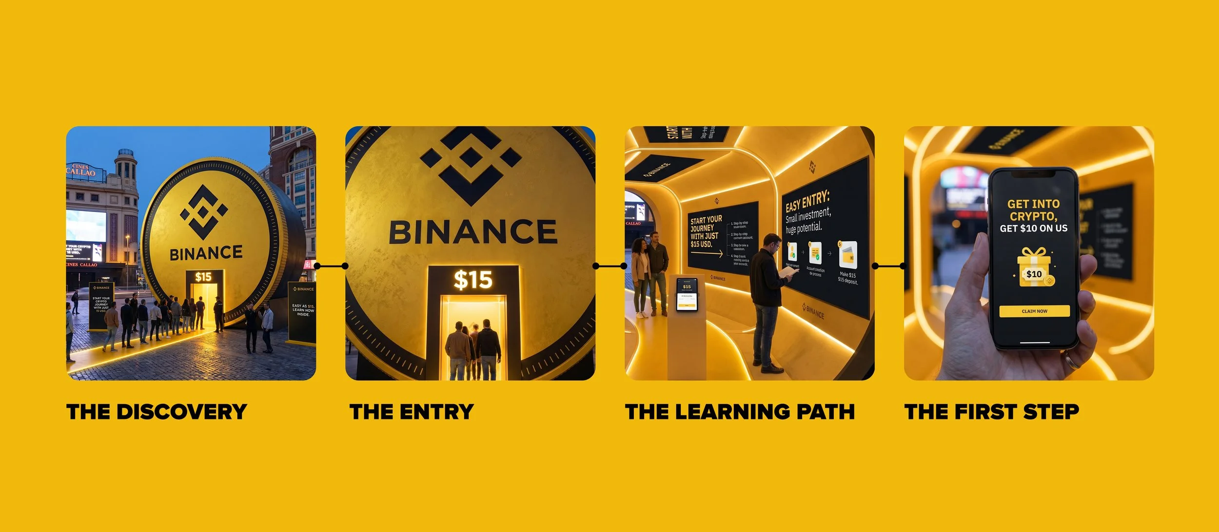
A larger-than-life crypto gateway would appear in Callao, one of Madrid's most visible public spaces. From the outside, the structure feels big and impressive, reflecting how many people perceive crypto. But at its base, a small, illuminated entry point marked $15 communicates the real message of the campaign: the starting amount can be much lower than people think.
Experience:
People are invited to enter the gateway and go through a short educational journey that explains how they can start trading crypto with as little as 15 USD.

Localized ads
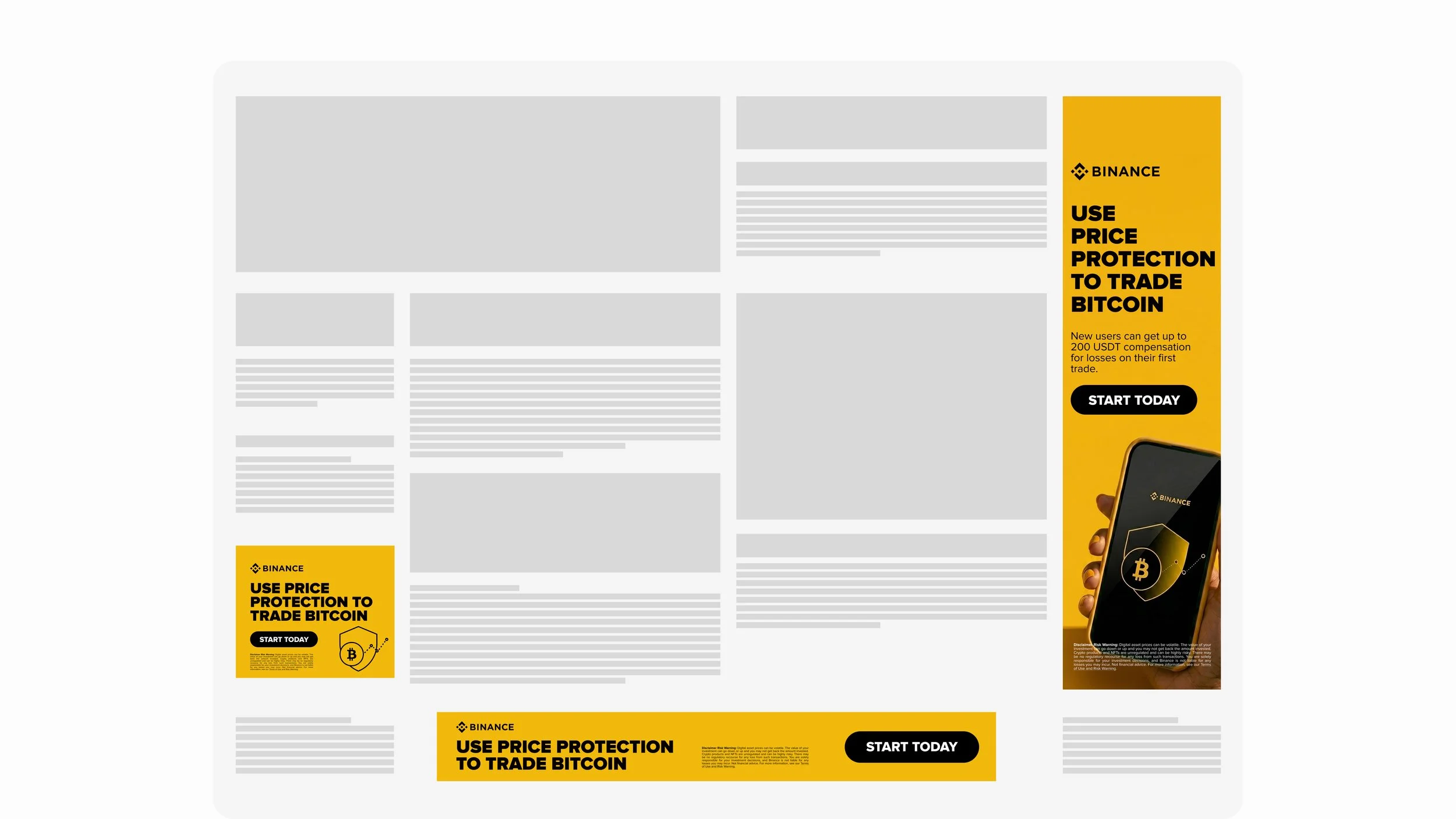
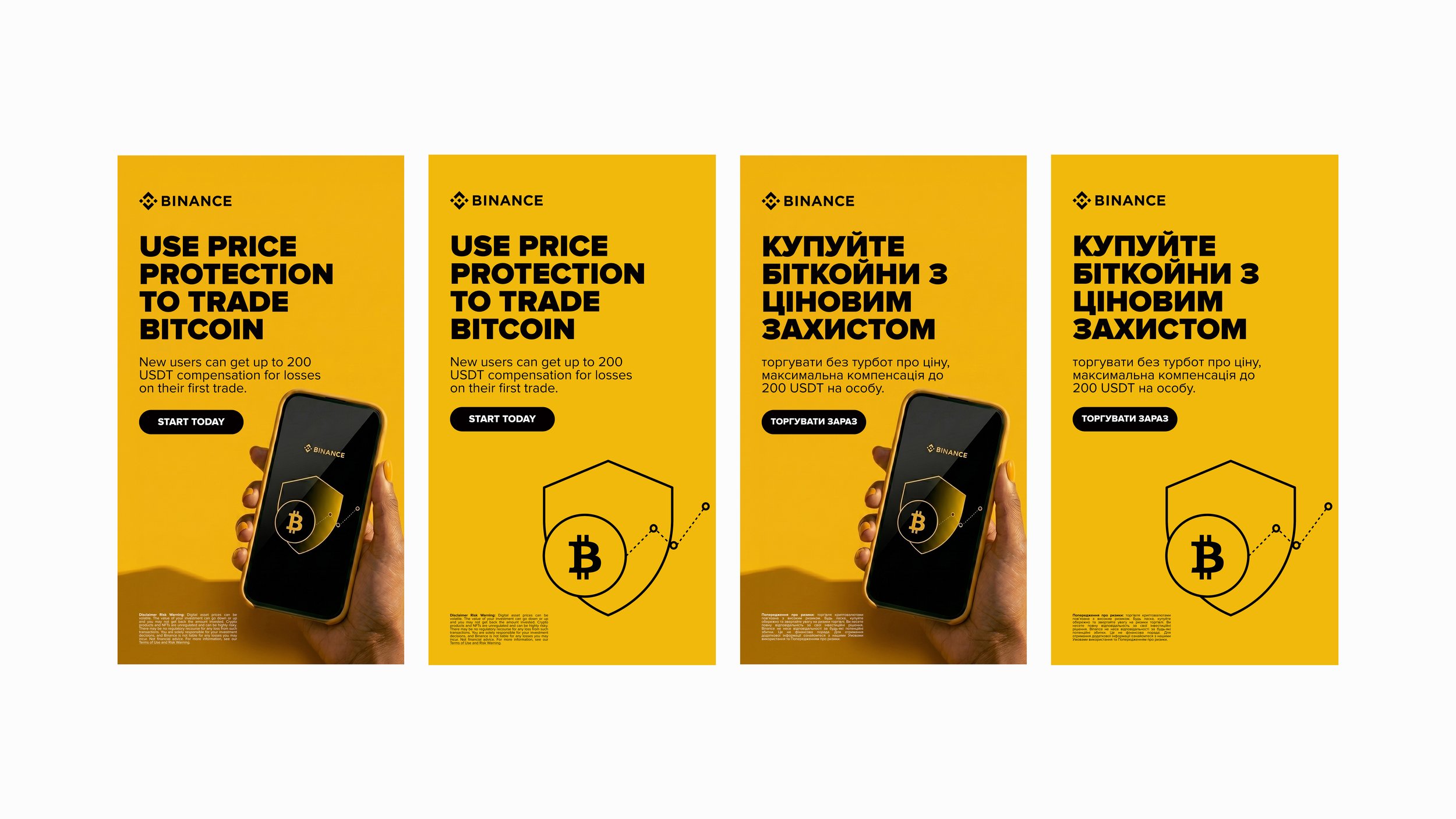
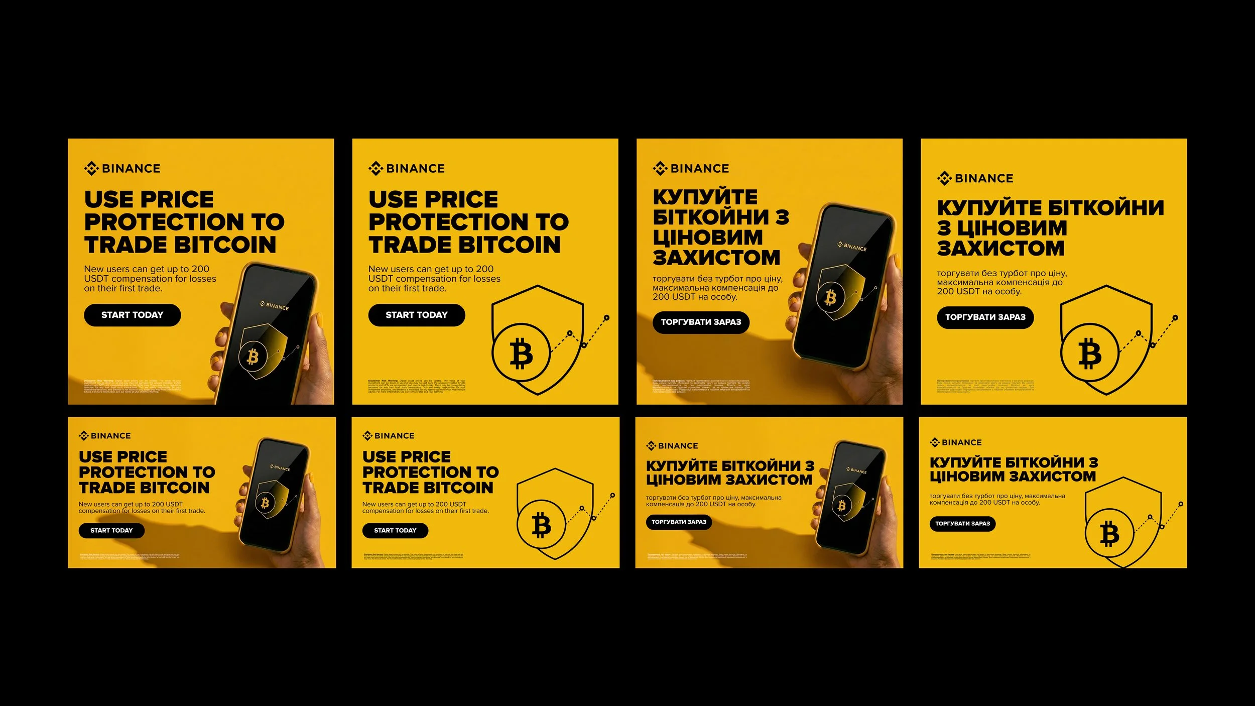
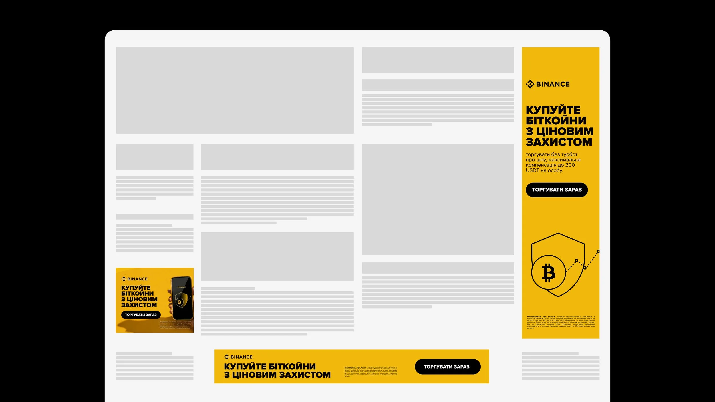
The second part of the project focused on adapting paid ads for Binance’s Price Protection campaign.
I worked with the provided copy to create ad adaptations in both English and Ukrainian. The challenge was not to build a new campaign from scratch, but to make sure each version worked across different languages, formats and sizes.
I focused on keeping the visual system consistent while adapting the layout to each dimension, making sure the hierarchy, readability and overall balance were clear in every format.
The goal was to create a set of paid assets that felt aligned with Binance’s visual language, while making the Price Protection message easy to understand across markets.