Overview
Year: 2026
Sector: AI / Crisis Management
Role: Full ownership
Outcome: Brand identity, AI generation, campaign direction
It started with a simple curiosity: what would the visual universe of a crisis consultancy look like?
The project began without a brief, only with a premise: to design an identity capable of representing the tension between two opposing states: crisis and calm. I wanted to build a brand that didn’t speak from chaos, but from anticipation: that moment before escalation, when a signal can still be read, interpreted and turned into a decision.
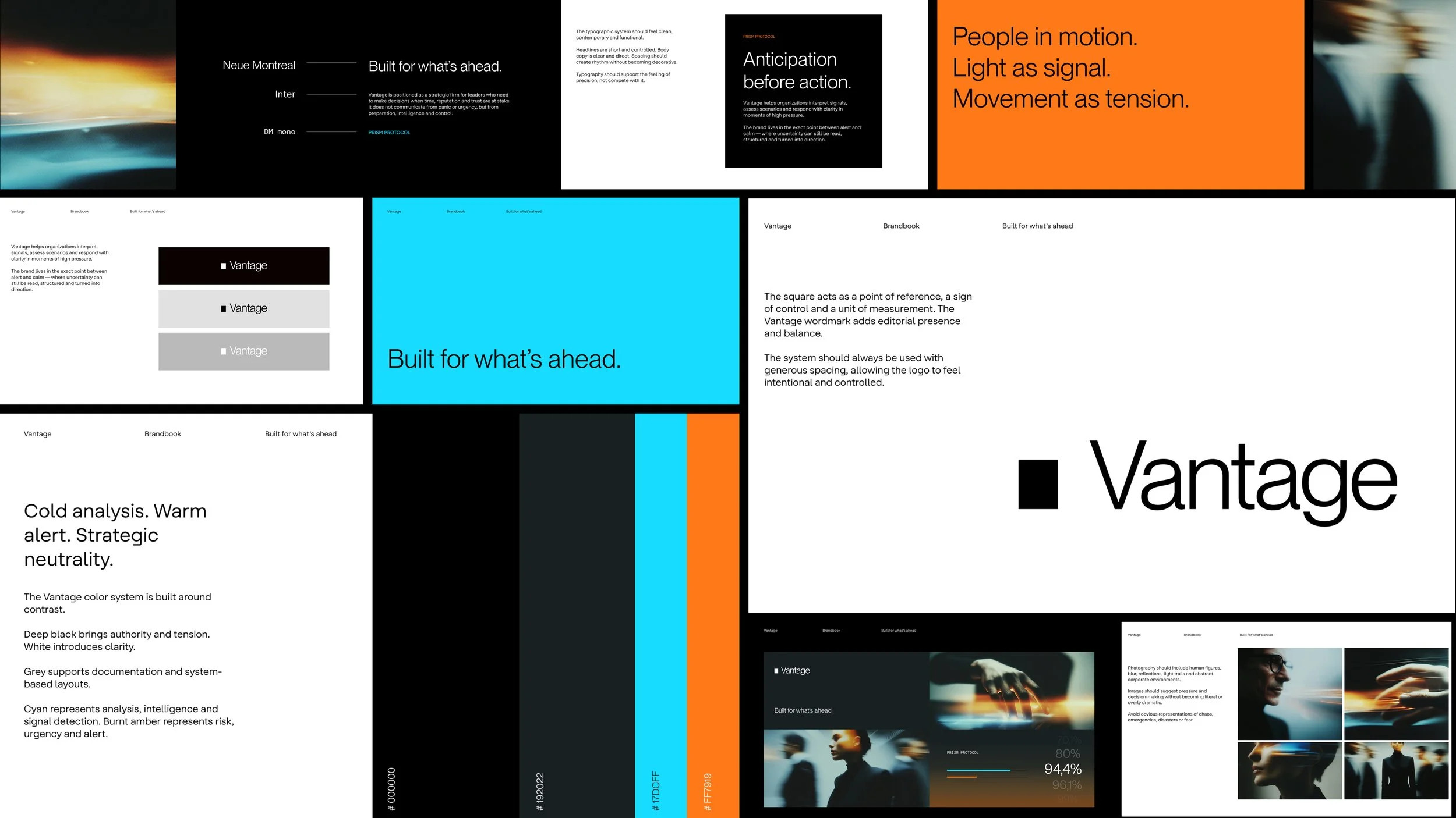
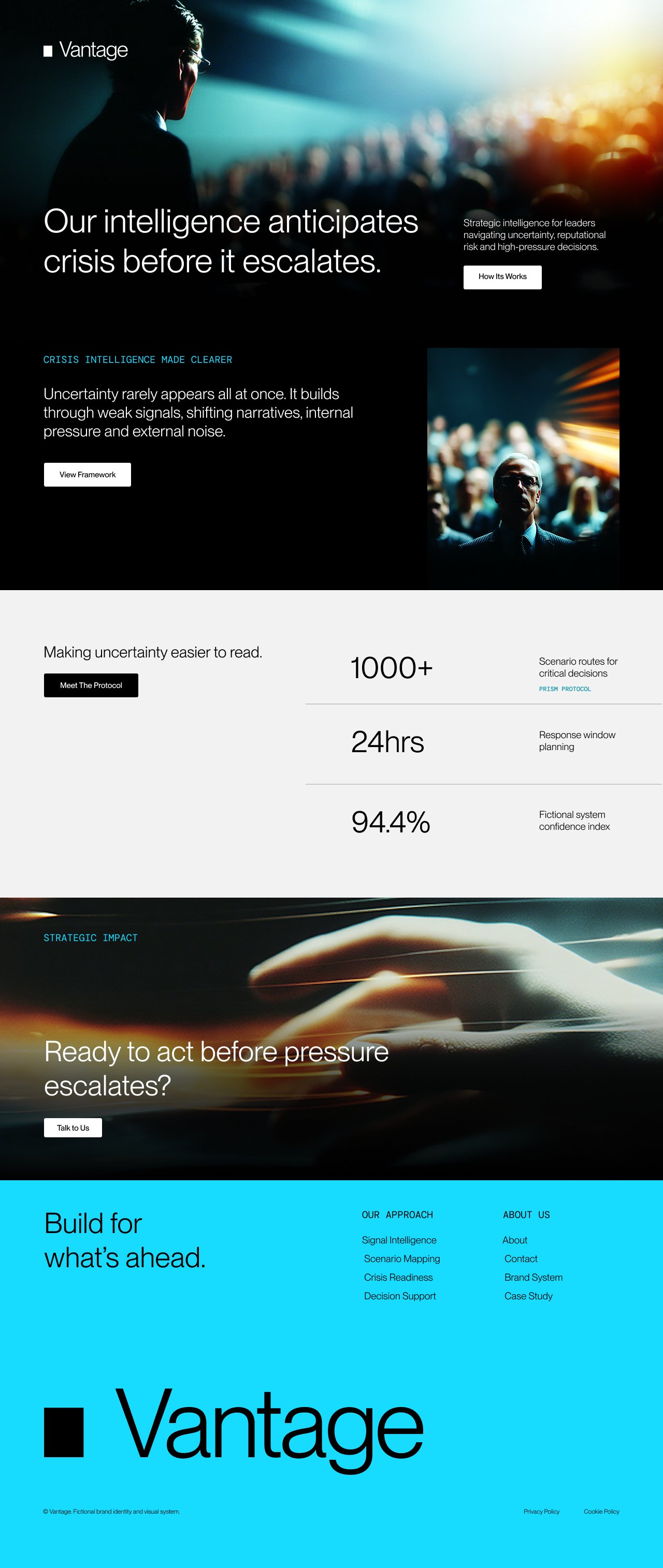
From that idea, I developed Vantage, a fictional crisis consultancy and anticipatory intelligence firm. The contrast between crisis and calm became the guiding thread of the entire visual system.
Challenge
The challenge was to build a brand that didn’t feel like a traditional agency or a cold institution, but like a firm capable of acting before a crisis escalates.
I wanted to translate abstract concepts such as anticipation, risk, precision and control into a visual system that felt recognizable, flexible and emotionally powerful. The brand had to feel strategic and restrained, while still carrying enough intensity to speak about pressure, uncertainty and decision-making.
Visual
Concept
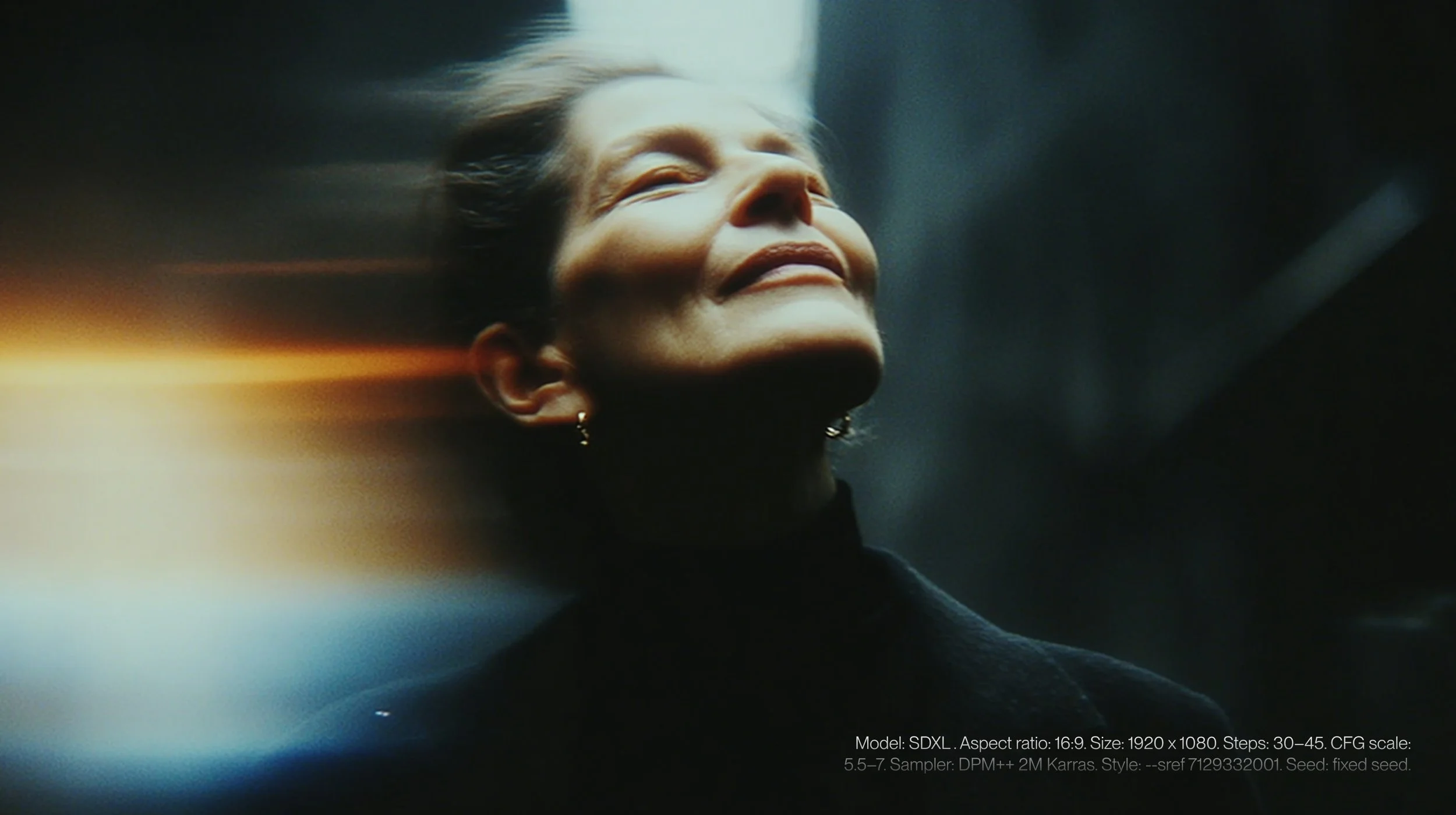
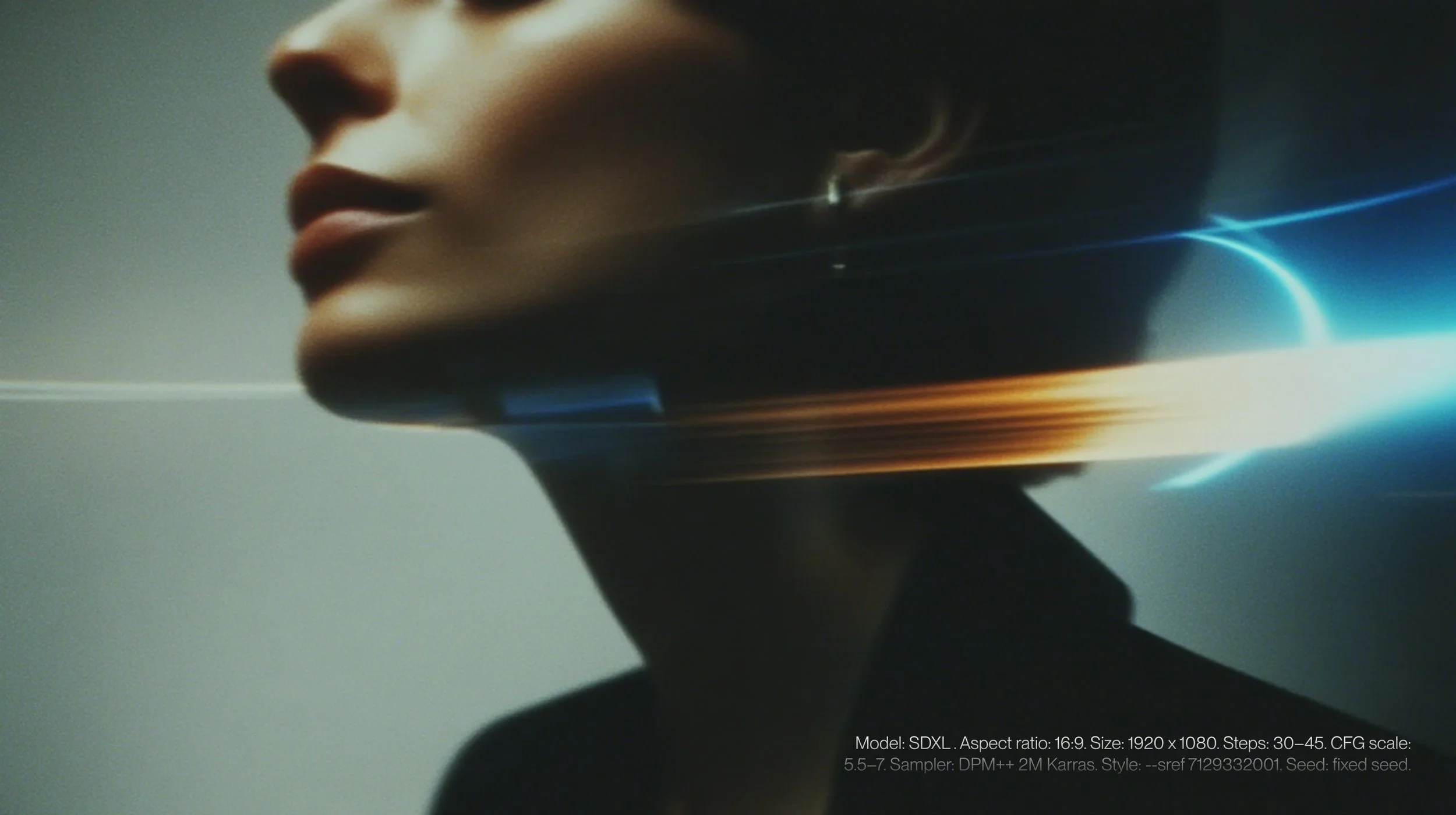
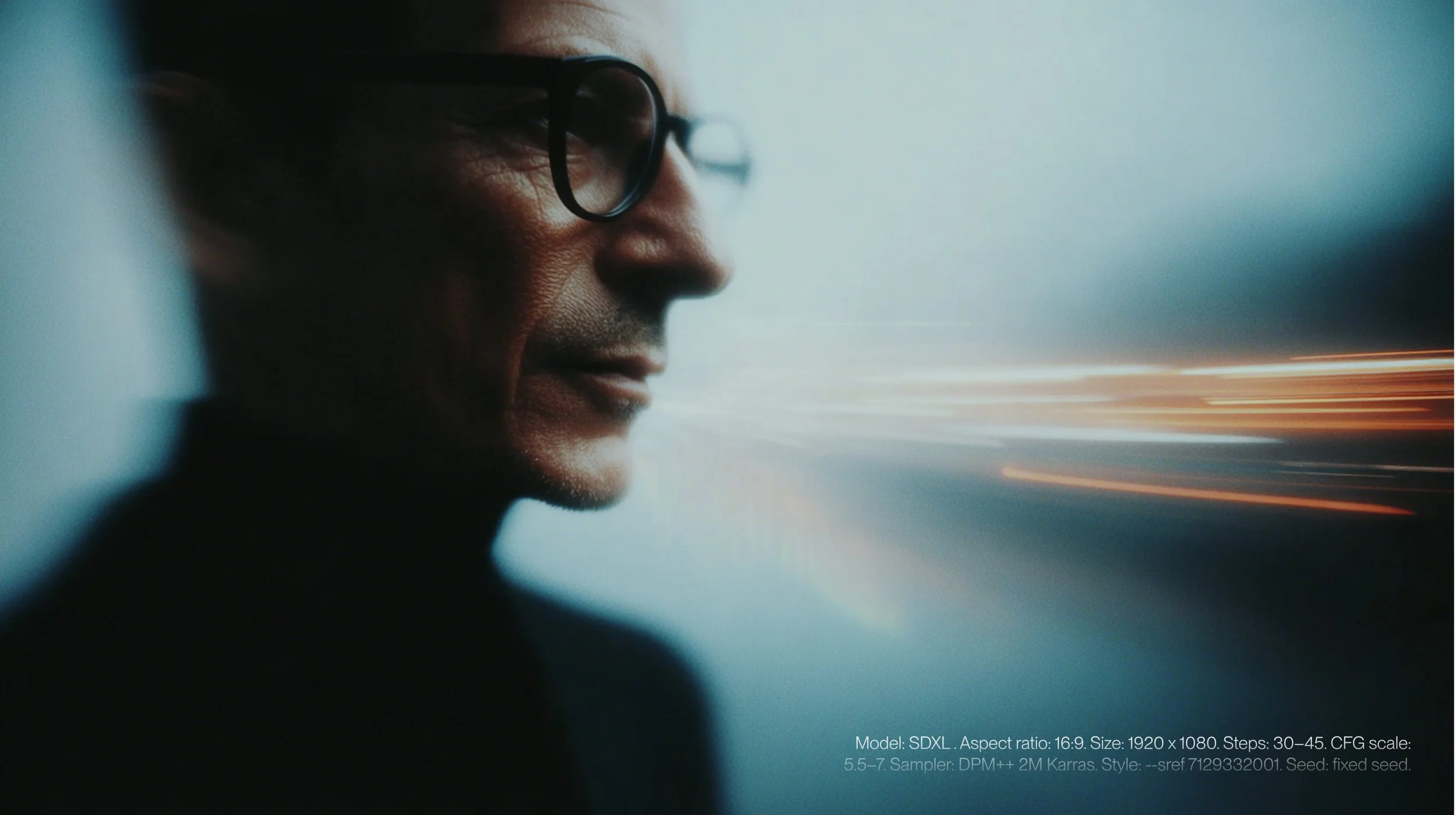
The visual concept is built around the tension between the cold blue of calm and the burnt amber of alert. I worked with blur, light trails and human figures in motion to suggest speed, pressure and decisions made in high-uncertainty environments.
Technology appears as an almost invisible infrastructure, while people remain at the center of the strategy. That relationship between system and human judgment was key to preventing the brand from feeling purely technical or distant.
Tools
During the process, I explored Midjourney and Stable Diffusion as tools for visual direction. I used them to generate atmospheres, abstract scenes and campaign assets that helped expand the brand universe.
AI was not the concept behind the project, but a tool to visualize it. It allowed me to test framing, lighting, movement and chromatic tension until I found a language that felt coherent with Vantage’s central idea.

Outcome
The result is a visual identity for a fictional firm that operates before a crisis escalates. I developed a system based on the contrast between calm and alert: cold blue, burnt amber, restrained compositions, images in motion and a clean typographic presence.
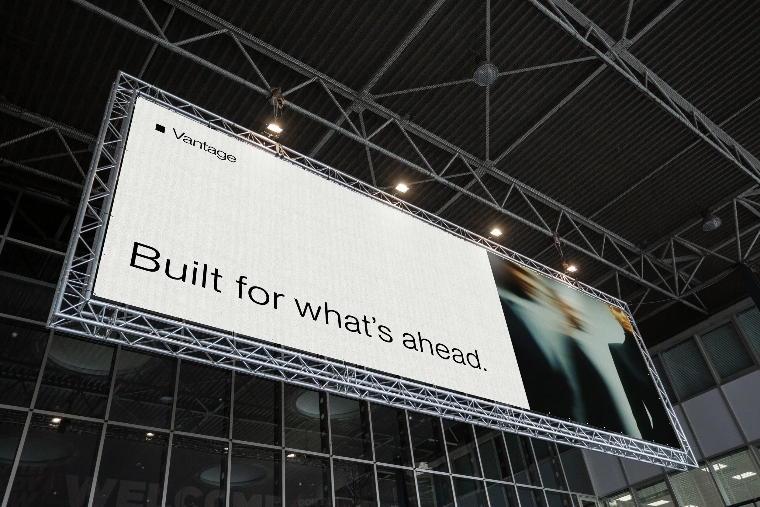
Vantage can live across different formats: brand guidelines, social media, editorial pieces and outdoor media without losing coherence. Rather than representing crisis literally, I aimed to create a visual universe capable of communicating anticipation, precision and clarity under pressure.